The unequal counties of America
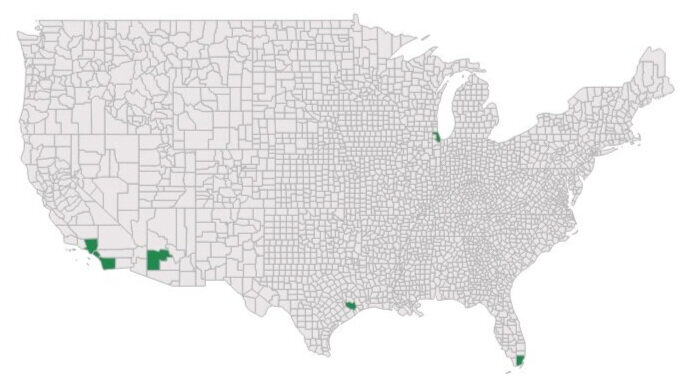
County-level maps have the pernicious effect of making the viewer imagine America's counties as rough equivalents, to which we should give equal attention. And yet 1 in 10 Americans lives in only 7 counties: Los Angeles, San Diego, or Orange (Calif.), Cook (Ill.), Harris (Texas), Maricopa (Ariz.), and Miami-Dade (Fla.).
by Andi Egbert, Sr. Research Associate
The unequal counties of America
We have to stop being so dense about population density
Do you care about equity? Or democracy? Good. Then we need to have an honest conversation about our maps. Especially those county-level maps.
You know, the shaded-color “choropleth” maps that purport to tell us everything from our health outcomes to voting behaviors to opioid prescribing rates to likelihood of being audited? We need to do so much better. And I say we because I’m as guilty as the rest of the journalists, data visualizers, and other map-makers in this regard: most of us share a history of pouring data into county-level maps with as little forethought as refilling the ice cube tray. But I’m starting to lose sleep about it these days.
I have no quibble with county-level overlays on weather maps, or road maps, or those showing topographical features. You folks, carry on: your work is legendary.
But when it comes to describing how or what people are doing, county-level maps do an almost criminally poor job of revealing the status of most Americans. That’s because America is a patchwork of 3,142 counties (or equivalents), but Americans are not equally fond of living in all of them. Far from it.
Source: U.S. Census Bureau, vintage 2018 Population Estimates.
According to the latest population data:
Illinois is carved into 102 counties, but Cook County comprises nearly 5.2 million people, or 41% of Illinois’ residents.
Texas contains 254 counties, but nearly 1 in 6 Texans live in Harris County, population 4.7 million.
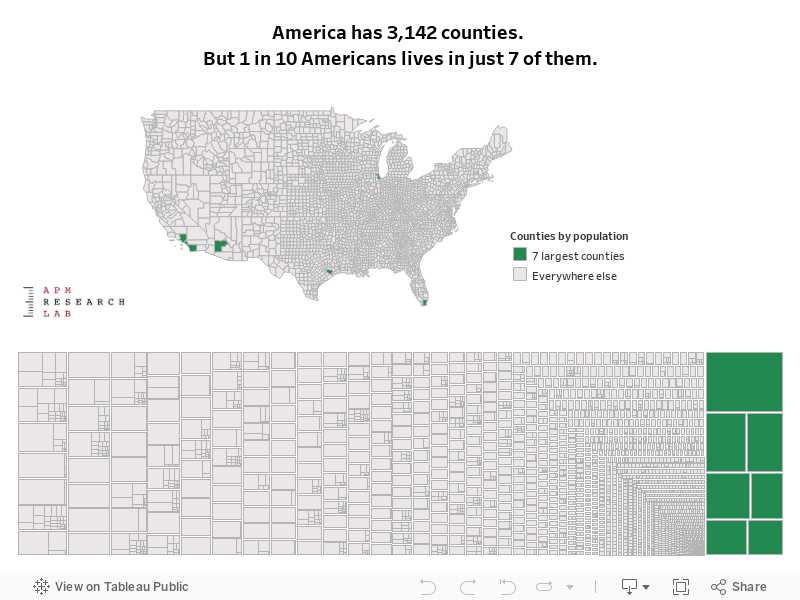
In fact, 1 in 10 Americans lives in one of just seven counties.
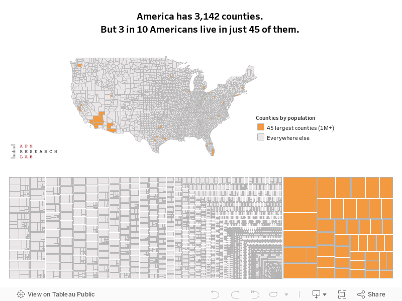
The 45 largest counties, all those with a population of 1 million or more residents, are collectively home to 3 out of all 10 Americans.
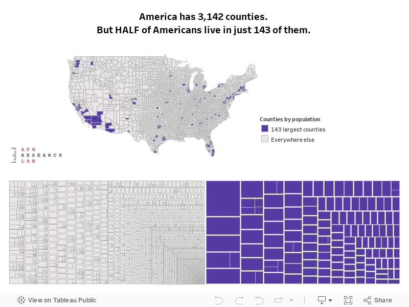
Half of all Americans live in less than 5% of all counties (143 total) and fully 90% of Americans live in only 36% of all counties.
Yet on countless county-level maps, all of these geographies get equal billing. This has the pernicious effect of making the viewer imagine these counties as rough equivalents, to which we should give equal attention. Given these wildly disparate populations, this is like comparing a potted plant to a redwood forest.
The most obvious example of this are the numerous county-level maps depicting broad swaths of red following the 2016 Presidential election. Although President Trump won 84% of all counties, he received only 46% of the popular vote. But county-level maps leave the impression of a landslide.
The 10.1 million people who live in Los Angeles County are greater than the combined populations of Wyoming, Vermont, the District of Columbia, Alaska, North Dakota, South Dakota, Delaware, Rhode Island, Montana, Maine and New Hampshire.
Here in Minnesota, the largest county of Hennepin is 381 times more populous than the smallest, Traverse. While Hennepin is home to 22% of all Minnesotans, it is also home to 35% of our populations of color. So a map that equally features the state’s 87 counties commits both geographic bias and racial bias.
For example, Hennepin appears as one of the state’s leaders in educational attainment on a typical map, with nearly half of its adult residents possessing a bachelor’s or higher degree, the highest of any county. Yet within it lie three census tracts in north Minneapolis where 10% or fewer of the residents have earned a four-year degree—a lower percentage than in any Minnesota county. These census tracts are populated by mostly Black and Asian and Latino residents, and their combined population of more than 8,500 is greater than each of Minnesota’s 13 least populous counties. But their needs are not visible whatsoever on a county-level map. And being visible is a necessary step to securing resources.
The same disadvantage occurs in virtually all of our nation’s urban counties, where populations of color predominate. As the group size gets larger, the more likely it is that certain subgroups’ needs or outcomes will be rendered invisible.
Source: U.S. Census Bureau, vintage 2018 Population Estimates.
Inequitable representation
It’s no stretch to say that the manner in which county-level maps privilege spatial accuracy over demographic accuracy can be undemocratic. Of course, there are plenty of examples of political outcomes that are impacted by the same phenomenon. As Farhad Manjoo wrote in a recent New York Times opinion piece, “the presidency, the Senate and the Supreme Court are all constitutionally tilted in favor of places where no one lives.” While the living-breathing-residents of these places may take umbrage at his use of “no one,” his point remains.
Los Angeles County is home to more than a quarter of Californians and more than 3 out of every 100 Americans. The 10.1 million people who live in LA County are greater than the combined populations of Wyoming, Vermont, the District of Columbia, Alaska, North Dakota, South Dakota, Delaware, Rhode Island, Montana, Maine and New Hampshire. And yet, these 10 states enjoy the privilege of 20 U.S. Senators to represent their interests and (also considering D.C.), the political power of 35 electoral votes.
While Americans should continue to press for fair political representation for all residents, fortunately we don’t have to wait on Congress to begin to make more equitable portraits of America in our displays of data.
Source: U.S. Census Bureau, vintage 2018 Population Estimates.
Listening to demography
So, what is the alternative to maps that are deaf to demography? Both treemaps and cartograms accurately account for population distribution but are infrequently used. Fivethirtyeight featured a fine one recently, scaled by number of electoral votes. 3D maps are novel but not very practical. Sometimes we have to concede that just because we have geographic data, it doesn’t mean we must make a map.
In November 2016, the New York Times detailed the various ways it has tried to represent voting outcomes, each with trade-offs. But when the media outlet released a hyper-local interactive choropleth of voter outcomes with no consideration for population density in July 2018, “cartography Twitter” and a few others took them to task (e.g., “Empty land doesn’t vote”).
To those of us who create maps and visualizations, before we begin each project, let’s pause and ask whom we are privileging and obscuring with each choice. And all of us who are data consumers need to demand better data from federal and state agencies, for starters. Further disaggregation—to cities or census tracts or other smaller geographies—is essential for America’s largest counties.
Of course, no one map (or chart) can tell the whole truth. But we have to stop being so dense about population density. Making America’s populous places far more visible is essential if we are to understand or improve the lives of the millions of Americans residing within them.
-Andi (@DataANDInfo)
Reactions? Please email us your thoughts or join the conversation on Twitter or Facebook.