data Visualizations
Creating data visualizations is one of our specialties. Virtually all of the articles we produce include graphs, maps or interactives. This page includes links to some visualizations we have created for other reporters and outlets that do not appear elsewhere on our website.

In the wake of strikes and peak TV, Hollywood’s workforce is shifting away from LA and New York (April 18, 2024; Marketplace)

Minnesota 4-year graduation rates slipped in 2023 (Mar. 28, 2024; MPR News)

GOP sees opportunity in Minnesota’s 2nd District against incumbent Craig (Mar. 22, 2024; MPR News)

Biden, Trump prevail in Minnesota while facing deep cracks in their party bases (Mar. 6, 2024; MPR News)

BCA: ‘Disturbance’ calls often most volatile for law enforcement officers (Feb. 22, 2024; MPR News)

New financial assistance effort aimed at reducing Minnesota's stark homeownership racial gap (Feb. 9, 2024; MPR News)

‘Desperately short-handed’ Minnesota businesses curtail offerings, cut hours to get by (Nov. 16, 2023; MPR News)

Rochester eviction rates show no sign of slowing (Sept. 8, 2023; MPR News)
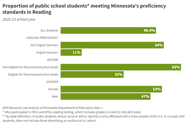
Minnesota test scores stagnant as COVID’s effects linger on students, schools (Aug. 24, 2023; MPR News)

Rising interest rates challenge Minnesota home buyers, sellers (July 17, 2023; MPR News)

Roe’s end brought big change to Minnesota and its neighbors (June 22, 2023; MPR News)

Minnesota graduation rates inch toward pre-pandemic highs (Apr. 25, 2023; MPR News)

Walz proposes checks for up to $2,600 based on income, family size (Jan. 24, 2023; MPR News)
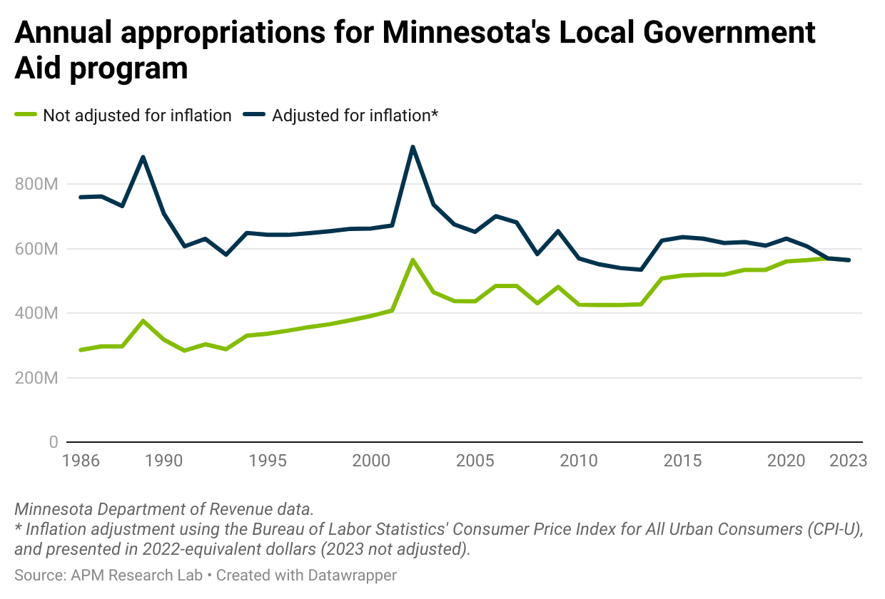
Election stokes optimism among city officials about state aid boost (Nov. 17, 2022; MPR News)
And here are just some of the noteworthy data visualizations that we have included in articles that we have written…

Florida homeowners insurance in five graphs
From our work with Marketplace on their 2022 season of How We Survive. That season the show is examined the livability of South Florida in the face of the climate crisis. APM Research Lab pulled together some charts to add some further context to their reporting.

POLL WATCH: Minnesota 2022
Minnesota is a battleground in the 2020 elections. See what various political polls and leading national forecasters are saying about the races for the state’s 10 electoral votes, the U.S. Senate, and Minnesota’s Congressional races during the countdown to election day.

INOCULATION NATION: Americans get fewer COVID-19 shots in June, booster rate plateaus
As the halfway mark of 2022 approaches, the federal government’s vaccine distribution saw a upward tick in June. However, June saw the second lowest rate of vaccine administration this year so far. More importantly, over 250 thousand children under five have received their first vaccination shot.

GREEN ENERGY OUT OF THE BLUE: The rise of offshore wind energy in the U.S.
The offshore wind industry is one of the most promising renewable energy sectors. At its maximum potential, it can produce more than 120,000 gigawatts, or 11 times the projected global electricity demand in 2040. Here’s what the future looks like for the offshore wind industry in the U.S. and how it compares to developments in other countries.

RURAL HEALTH AND HOSPITALS: A focus on Texas
For many rural communities in the U.S., health care is difficult to access. In partnership with the Texas Newsroom and Frontline, the APM Research Lab looks at the state of rural health in Texas through the lens of hospital closures, uninsured rates, EMS stations and more.
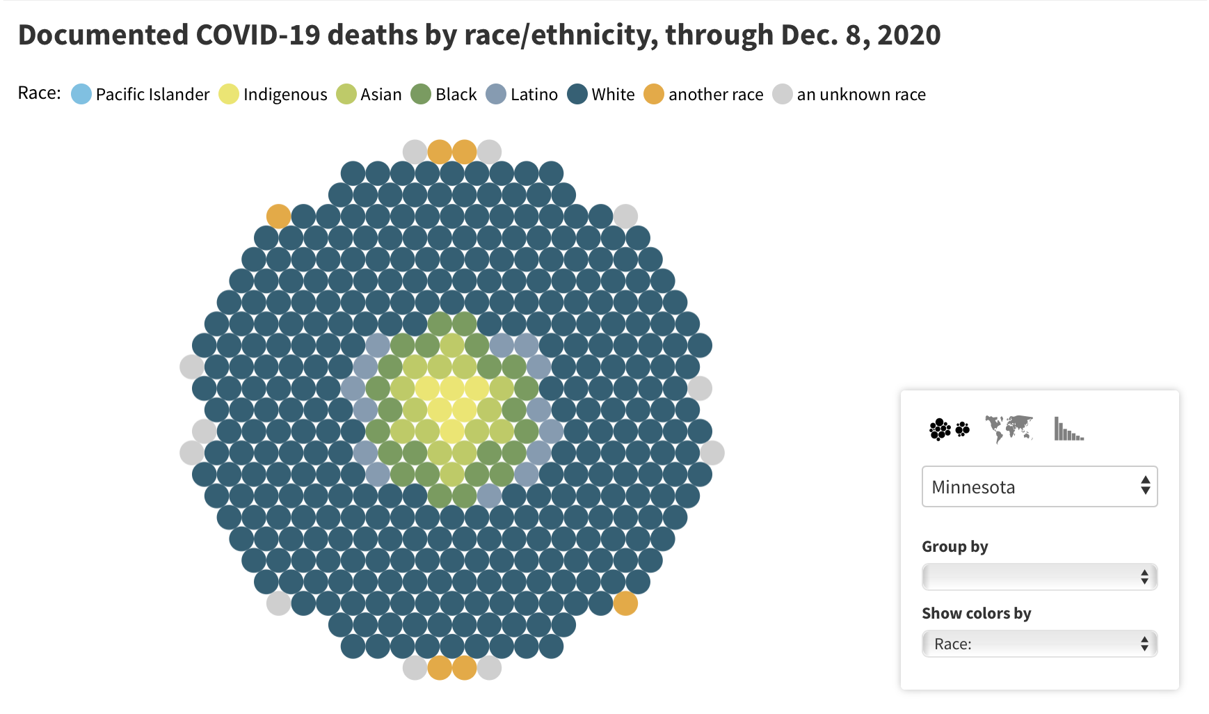
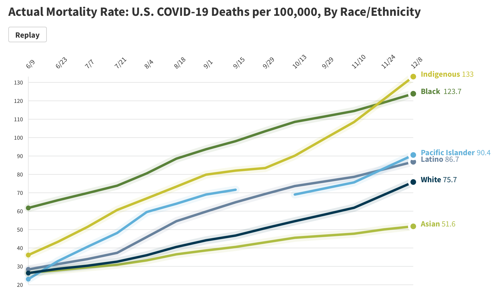
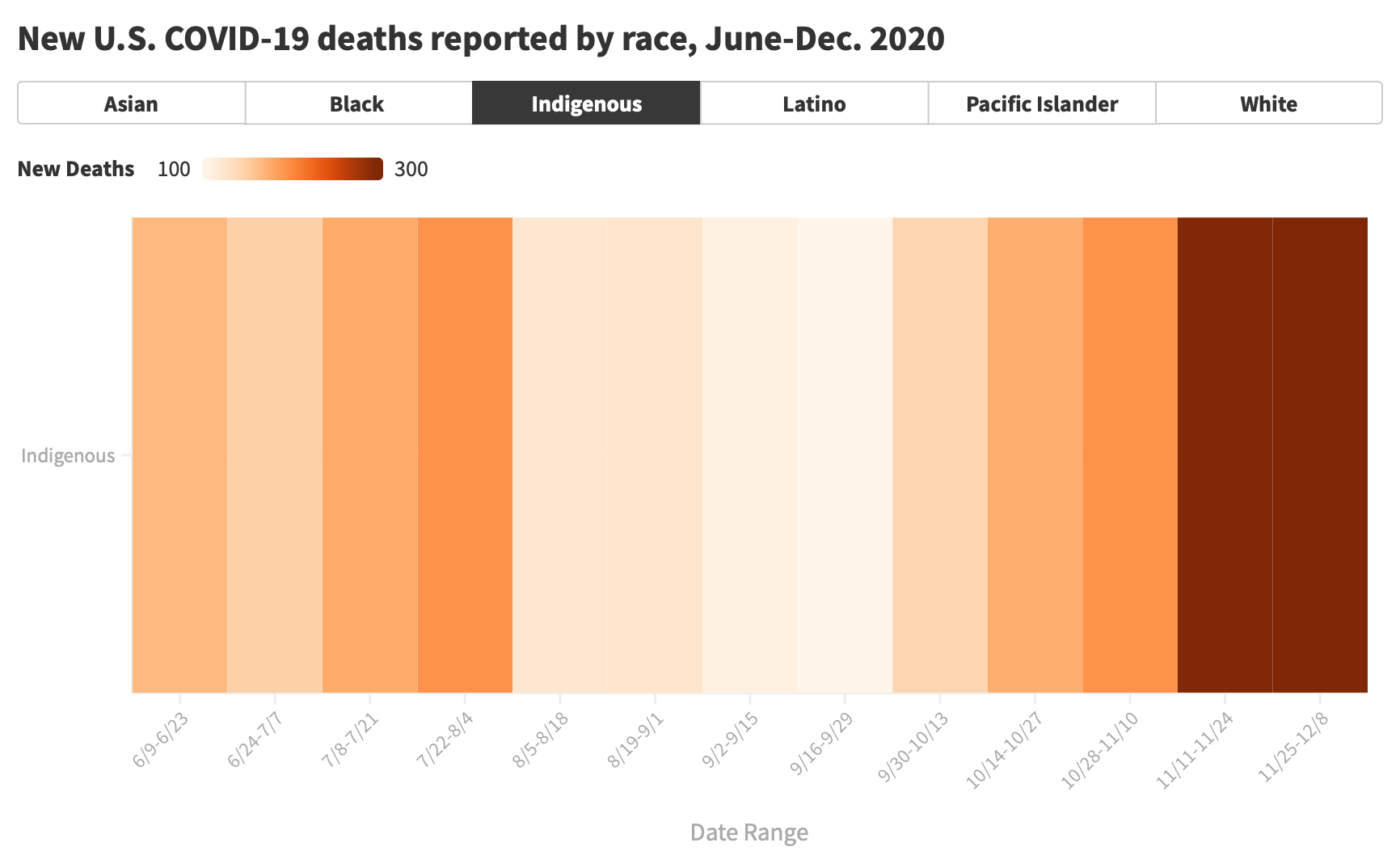
THE COLOR OF CORONAVIRUS: 2020 Year in Review
In the Color of Coronavirus: 2020 year in review, we present new visualizations to help readers conceptualize the loss of human life that has resulted from COVID-19. This piece reflects on a year of colossal loss and grief by looking into the numbers.
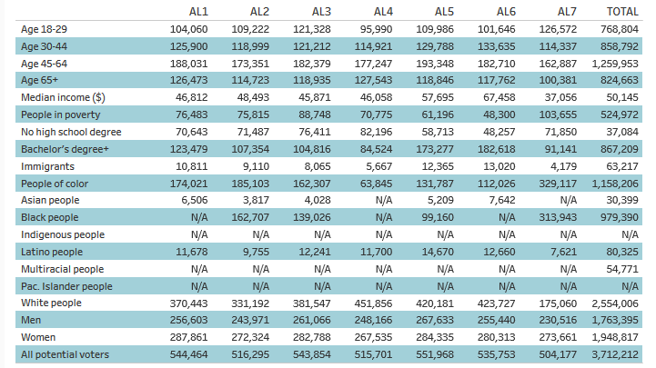
REPRESENTING US: 2020 Voter Profile Tools
In our fifth release of Representing US, we’ve updated our interactive Voter Profile Tools with the latest available data on the demographic and economic characteristics of the potential electorate—from education and poverty levels, to racial and immigrant make-up, and more.
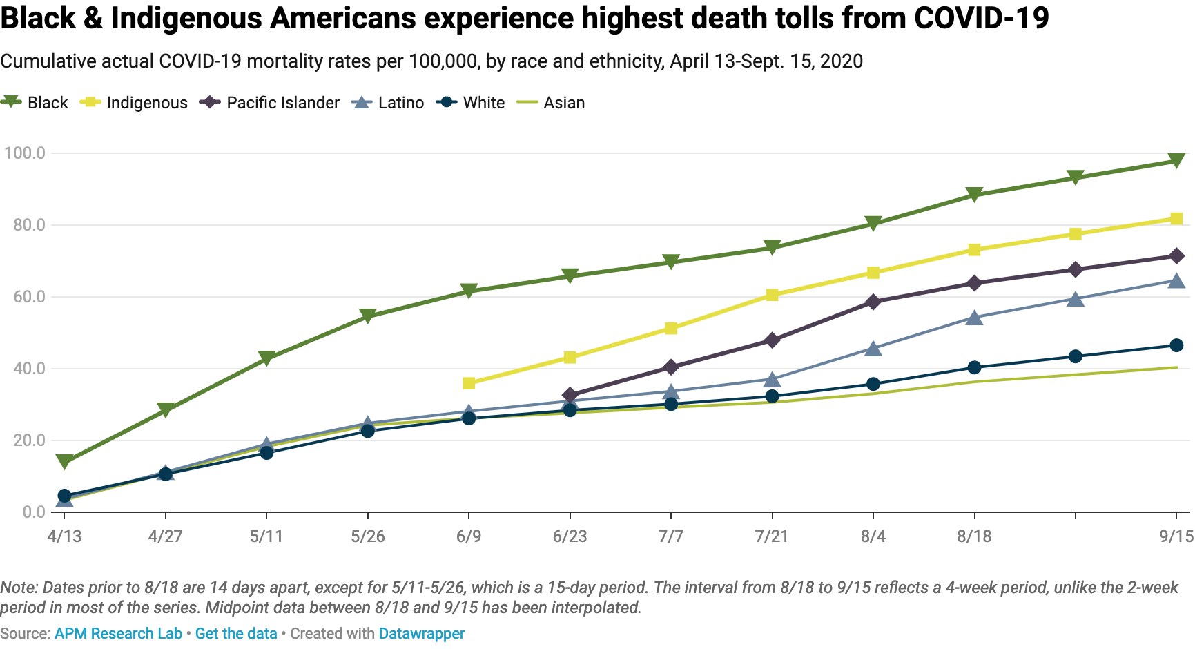
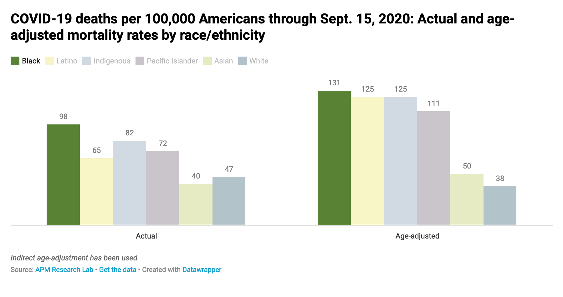
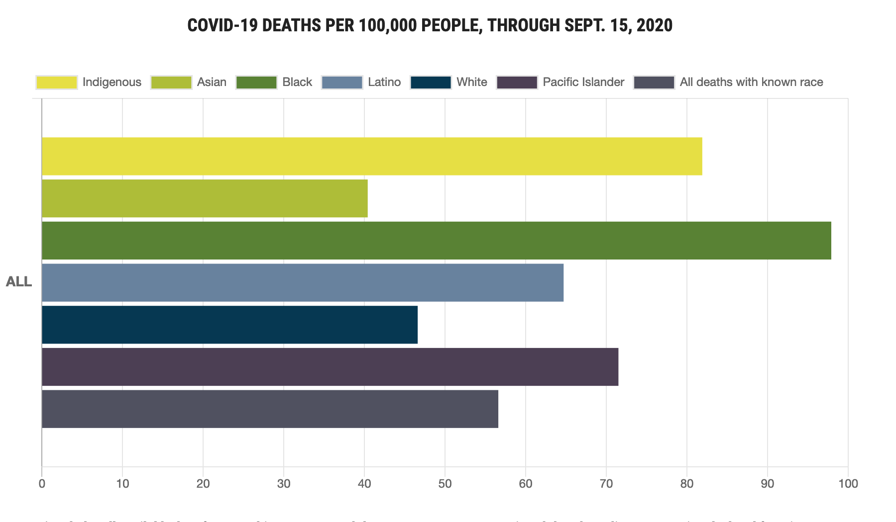
THE COLOR OF CORONAVIRUS: Deaths From COVID-19 Analyzed By Race And Ethnicity
Our ongoing Color of Coronavirus project monitors how and where COVID-19 mortality is inequitably impacting certain communities—to guide policy and community responses to these disproportionate deaths.
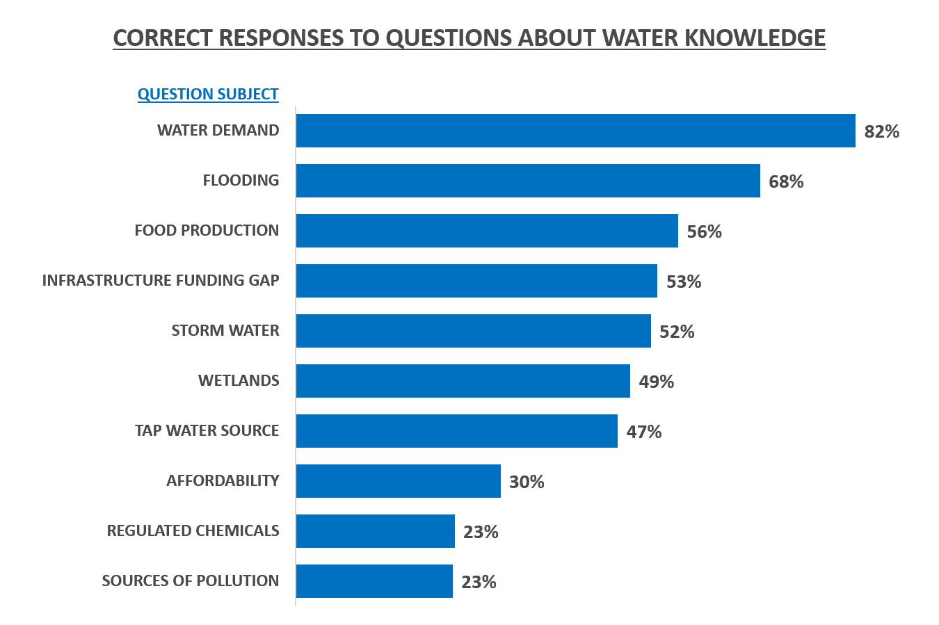
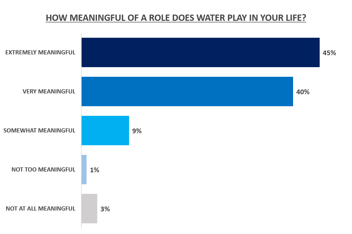
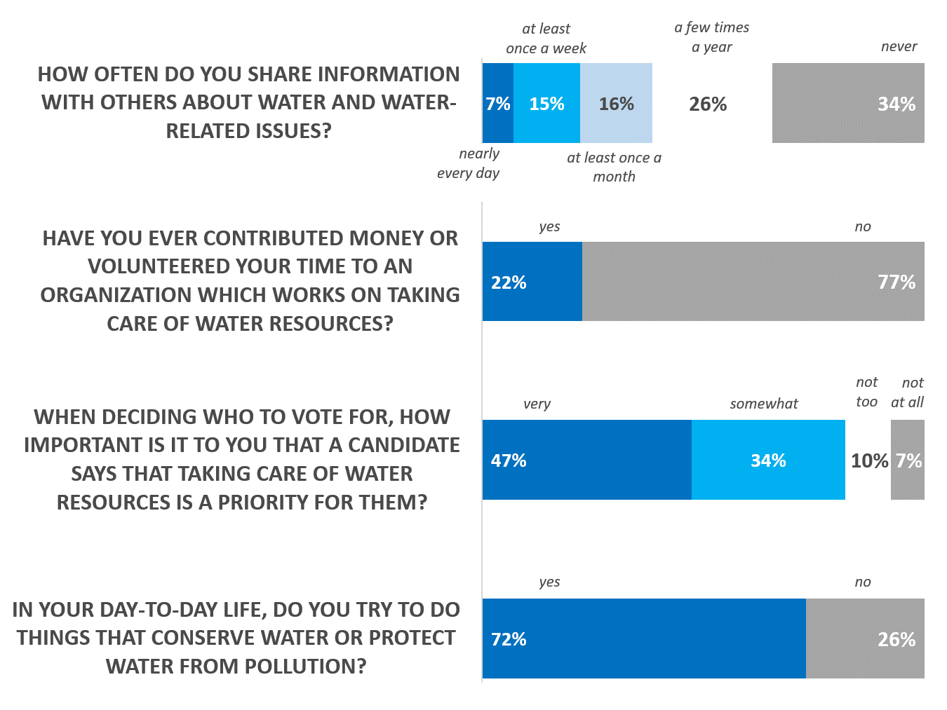
WATER + US: Americans Are Concerned About Water But Know Little About The Facts
APM Research Lab created scales to evaluate the people’s knowledge about, connection to and concern for and action on water issues in the United States. The results show that Americans care about water-related issues and that feel strong emotional connections to water; however, most people know relatively little about the current state of water infrastructure in the U.S.

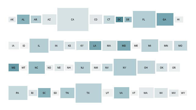
White Voter Share Declines In 15 Battleground States
APM Research Lab analyzed 15 battleground states for the 2020 presidential election and found that the power of White voters has declined in all these states. As a result, voters of color will be more influential in 2020 than in any prior election.

These Are The States Receiving The Most Subsidies From The Trade War
Our collaboration with Marketplace analyzes and maps USDA’s payments to agriculture producers intended to ameliorate the effects of the trade war with China. The data show more than a million payments from the program’s inception in fall 2018 to Nov. 1, 2019. During that time, the U.S. government paid almost $10.5 billion in subsidies.

A Deeper Analysis Of Census Bureau Data
Our Roots Beyond Race project is the most comprehensive portrait of Americans’ identity available anywhere. Conversations about race and ethnicity in the U.S. are usually limited by the five or six checkboxes on the census, but our data visualization tools go beyond the simplified racial categories with nearly 200 heritage groups that demonstrate the complex and overlapping origins of those who live in the United States.

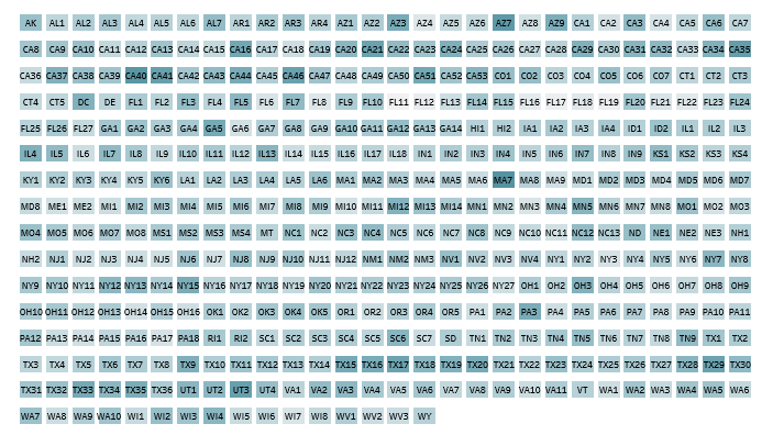
Representing US
Our nonpartisan Representing US project has been exploring the differences across all 435 U.S. House districts—from education and poverty levels, to racial and immigrant make-up, to congressional and presidential voting history, and more.
With this, our third release of Representing US, we’re highlighting the November 6, 2018, election outcomes. All vote percentages have been certified by states.
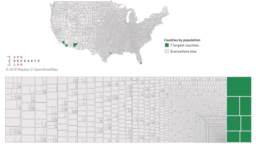
The unequal counties of America
County-level maps do an almost criminally poor job of revealing the status of most Americans. That’s because America is patchwork of 3,142 counties (or equivalents), but Americans are not equally fond of living in all of them. Far from it.
In fact, 1 in 10 Americans lives in one of just seven counties.

Prescribed Opioids: Trends & Hotspots
The opioid crisis now lowers life expectancy more than firearms or motor vehicle accidents. In 2017, opioid-related deaths reached 47,600 — six times as many as in 1999. Public health officials have sounded the alarm and politicians across the spectrum have identified opioid abuse as a national crisis.

How the housing market has changed over the past decade
Millions of Americans lost their homes during the Great Recession. Now, more than 10 years later, we are examining key changes in the housing market: renting rates, affordability challenges, and home ownership opportunities for the nation’s largest cities, coast to coast.

What’s driving your state’s growth? Babies or suitcases?
The reallocation of electoral points and congressional seats set to occur after the 2020 Census has heightened the interest in state population tallies in the final years of this decade. That, along with a tight labor market, has ratcheted up competition for luring workers across state lines and from abroad.
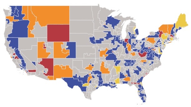
Women are running in more than half of all U.S. House races this November
Major party women candidates will appear on nearly 50% of the ballots for all U.S. House contests, which could lead to a sea change in gender balance in Congress.

College: Who's going, finishing, and finding work afterwards
While those who’ve earned bachelor’s degrees reliably fare better than those with less education, the employment prospects of recent college grads vary from state to state. In 8 states, recent college grads faced a more challenging labor market than the national average, with the highest unemployment rates in West Virginia (9.3%) and New Jersey (6.8%).

Against a backdrop of declining babies, Utah leads the nation in birth rates in 2017
In demography, natural change refers to a simple population equation: births minus deaths. Natural increase is when the number of new babies outnumbers residents who have died; natural decrease is the opposite.
Of the 42 states who saw population growth in 2017, more than half of them (23) have natural increase — not migration — to thank for the majority of their growth.

Destination U.S.: Five facts about states’ international migrants in 2017
Each year when the Census Bureau publishes its best estimate of each state’s total number of residents, it also includes data about what’s driving those population tallies higher or lower—including births, deaths, domestic migration, and international migration. International migration is the most variable part of this equation as federal immigration policies, changing global economic conditions and other factors can dramatically change the flows of people into (and out of) the United States.

Delayed adulthood: The Millennial falsehood
A recent U.S. Census Bureau report on the changing profile of young adulthood compares young adults (age 18-34) from 2016 to those from 1975. According to the report, Millennials are more likely to be employed (largely because of the rapid growth women in the workforce), more likely to obtain higher levels of education and more ethnically and racially diverse than preceding generations.

Who has a permit to carry a gun in public? And what are they thinking?
Relatively little is known about the demographic characteristics of those who legally carry handguns in public. Even less is known about how their opinions compare to people who don’t have such permits. A recent report from the Minnesota Department of Public Safety, along with data from our recent Ground Level Survey with Minnesota Public Radio News shed some light on both.

Migration magnetism: Five facts about 2017 state-to-state population movement
The flows of people across state boundaries — domestic migration — can be a topic of interest for everyone from economists and businesses to housing developers and policy makers to those for whom it’s just a point of state pride.

In the U.S., language diversity covers the map
Did you know that 17,000 Tennesseans speak Arabic? And 177,000 residents of Illinois converse in Polish? However, the likelihood that your ears will encounter non-English words is highest in California, where 45 percent of residents speak a language other than English. That’s nine times the linguistic diversity that you’ll find in Kentucky or Alabama, where only five percent of residents speak another language than English.
You can also view many of our vizzes on our public Tableau page.

States by Official and Supplemental Poverty Rates, 2014-2016
This September the U.S. Census Bureau announced that 12.7 percent of Americans, or 40.6 million of us, officially live in poverty. In the very same announcement the Bureau reported that 14.0 percent of Americans, or 44.8 million of us live in poverty. Huh?

Labor force participation rate by age group, Minnesota, 2016
A strong job market and industrious behavior places Minnesota atop national rankings for labor force participation for every age group from those age 20 to 24 through the 55- to 59-year-olds. Minnesotans can’t even complain about lackadaisical teenagers; that group ties for the nation’s third-highest participation rate.